Creating a digital product requires many professionals and skills. To deliver an intuitive website or app and enhance usability you need an excellent UI text. Such microcopy includes menu labels, buttons, security notes, terms and conditions, instructions and tooltips, as well as error messages.
UX Writing is the production of written content that becomes part of, and supports, a product’s user experience.
The term UX writing doesn’t only include microcopy writing but also covers the complex process of research and close cooperation with UX designers. Moreover, the UI text can help to find issues with the design, so it’s worth working on it in the early stage of the designing process.
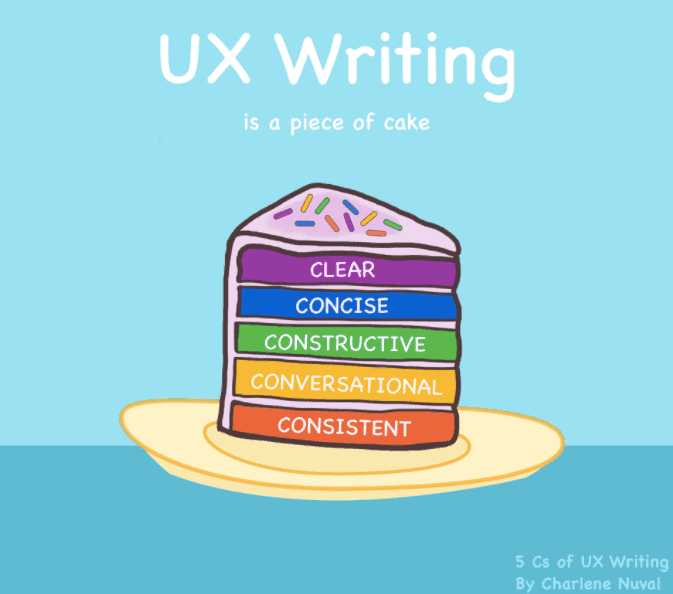
According to the 5 C’s of UX writing, UI text should be:
- clear
- concise
- constructive
- conversational
- consistent

Let’s dive into the tips that can help you craft effective microcopy for your website or app.
Start with the research
Before you craft the UI copy, research competitors, and similar solutions to identify which terms other writers are using to describe comparable actions and options. Identify your target group and adjust the language to their preferences. Later on, continue with research. Present your ideas to people who aren’t involved in your project to find out if the UI text is clear and understandable.
Use simple language
UI text has to be effortless to understand for end-users. While writing microcopy for digital products you have to focus on customers. Don’t use ‘sexy’ words and fancy expressions. On the contrary to marketing purposes, in UX writing you need to shorten the messages and do everything to make the processes as intuitive as possible.
Avoid technical jargon that might be unclear for some users. Make your digital product accessible for everyone, not only for the precise group of professionals.
Shorten the message
Usually, there’s a way to shorten UI text regarding the first version of it. Avoid long blocks of text and complicated sentences. Go straight to the point and keep the goal of a particular microcopy in mind.
Sometimes you can let the images do the talking. Not everything has to be explained with words. Enable your customers to seamlessly go through your products, using icons, arrows, and other visuals.
Keep the context in mind
While coming up with UI copy make sure to consider the context. Where and when users will be reading this text? Does it only appear to new customers or is displayed every time a user interacts with your app? People who visit your website for the first time might need more explanation and loyal visitors already know your product and want to quickly use it. Think about the other circumstances of the usage, such as the device. If you provide a mobile app, you can be sure that users will be using it on the go.
Give clear directions to the user
Error messages can be challenging to craft. They can cause a user’s frustration because they’re usually shown when an issue occurs. While designing such messages you need to include three aspects: problem identification, details, and a solution. Guide users to fix the issue and continue with using your products.
Additionally, don’t blame the user or use negative words when an error occurs. Instead, be friendly and explain how to fix the problem without frustrating customers. Don’t hesitate to use “Please” when you require an action.
Use your brand’s voice and tone
Even though UI text should be short and clear, your microcopy can still manifest your brand’s voice. It’s a great way to humanize your brand and communicate with customers in a more conversational way.
Voice includes language and specific words that your team is using in every copy, including marketing messages. Brand’s voice helps to interact with users and use emotions to build better relationships.
Pay attention to tone as well. It changes depending on the situation. The tone of voice will be different in an error message or welcome copy.
Using tone and voice can be especially visible and helpful while designing a chatbot. You can even give your bot a personality to enhance the experience.
Key takeaway on crafting UI copy:
- use specific verbs
- begin with the objective
- avoid double negatives
- use present tense
- avoid passive voice
- use numerals
- connect similar words
- avoid caps lock
- use ‘I’ when a user takes action
- use standard words
- be friendly and humble
We hope that now you can craft UI text that will make a difference when it comes to usability and leverage your digital product’s performance. To boost your website with superpowers – use RocketLink!
With RocketLink you can add your CTAs to any links you share. That way, you can drive traffic to your website and increase conversion. Master your microcopy within the widgets to craft resultful messages. Schedule a demo 🙂


